Service Design scientific explained and long scares
Science shows that many customers leave your website in 1/2 second and the ability to remember faces, gives that the customer never comes back
Here is a list what most can scare most customers: (Your checklist)
- Website without Service Design
- Headlines more than 200% bigger than normal sub headlines, blinking effects, pop-ups, animation… you have seen them, but not here.
- Long pages where user has to scroll to get bit of informations in super large fonts and many effects
- Product and Campaign sites demanding user to do such and such, they will never give what you expect
- Effects like elements in the background like pictures (Like Parallax), color changes, videos or music
- Filling out long forms, ONLY get phone number or E-mail… and your database grows daily
- To click a lot to get desired info, or have multiple menus.
My question is WHY using the above add-on, when all science shows it is not good for your website, your company and the sales?
When users wants to have information they want it fast. Typically in average you have 0.5 seconds to deliver info of what your page is about, and if you can’t you lost the attention.
Also you gain another psychological side effect in the users mind. They will never come back !!! that is what many science studies shows. So why not accept and learn of this?
The trick is, that the user, should NEVER do anything to gain something. Your time spending time on this will only ate more customers. Scientifically proved. That rule also reflects scrolling, clicking, filling anything out other than Phone or email. Animations take precious time. Leave it out. That is to take Care of your audience. Parallax is a waste of time and money. Why not use the proven Service Design in action… All the other has been disproven all these year. Designers know that – non-enlighted-designers present not to know.

Webdesign with Service Design gives you:
- A once for all Design Manual, so all the Corporate ID is described to the details. This gives you ability to easy change design if that should ever be the case
- Short pages where info can be read, adaptable to the menu setup, and screen resolution (it is not Responsive Webdesign) its called Proactive Adaptive Webdesign… or Service Design, the best technology of 2015 to implement
- Get to the point with an Art Director made design. No more than 200% difference in the headlines compared to your block text or sub headlines
- No Parallax, long pages, no glimmer, no animations, no background video, no timelaps color changes and so on… because it is not about the audience or the business discipline of 2015 which is: Service Design
- Easy access for basic information like phone number, email, address and CVR number
- Big letters not even in company or product names like in France… use links words with tag boxes explaining exactly what the word means, since you in the first place wanna make it bold or in big letters
- Access to Art Director education and knowledge in action and in Service Design, not a uneducated Web Designer. Dont use very strong colours, or special designs just because it looks smart… It does not… and usually the customers hate it
- Speed Optimising is shown to be the key to all websites and speed is no. 1 qualification in Service Design
- An Art Director to concern about your domain and IP address than of your design
- A proven backed up by science concept. Not a guess, assumings or presuming how the world is, as done by many other web designers
It is very simple. Its about attention, and it is about selling more and not losing customers. Short rules to remember… which can be fatal, if you dont use, and a succes if you wanna listen to the Science, The customers and a text like this from a Art Director
These rules goes to any pages of any kind wether it is Web, Facebook, Twitter and Linkedin… A simple question is
- “do you sell more with this on?” the answer is no.
- “do you sell more if you follow the rules?” the answer is yes.
Visual identity and psychological design
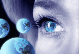
Visual Identity is assessed at 50 milliseconds. This means that advertising agencies must gear itself, to create a good impression with the company’s visual identity in just 0,5 seconds.
Several other studies also show that the picture of a web front and menu must be between 1 and 2 seconds. And no special menus, no extra menus, no demanding actions for user to get what he wants. If you want contact, please never ask for more than email or phone, it is enough for you to identity the person any ways. That will give you 500% more subscribers to a newsletter.
Read about how biology, psychology and emotions govern our everyday based on assumptions, guesses and suppositions. And so are ordinary webdesigners.
Originally written in Copenhagen For the Internet Magazine at 18.01.2008. 08:06 Source: www.michael.dk and abcdesign/promote/agiludvikling.dk
Brain research shows how consumers react.
The consumer who surfs take fast decisions about the quality of a website, say researchers at Carleton University in Canada. The research team, with Gitte Lindgaard in the lead, has researched how the visitor takes a decision on the content and the visitor wishes to continue just by skimming the front page of less than 1 second.
It comes as a surprise since until now has meant that Internet users would use at least 10 times longer to assess the content of a web site. But the fact is that overview, design and value is decided in under a second. According to a new study which is published in the “Journal Behaviour & Information Technology”
In the test series had the research team developed a number of websites that were shown in 50 milliseconds. Then asked to the participants to assess sites’ aesthetic appeal or we Denmark calls for visual appeal.
Then the participants were asked to examine the web rather thoroughly and then make a new assessment. The two assessment categories, the quick glance and the detailed study assessment were similar, the study showed.
Gitte Lindgaard says that unless the first impression is favorable, leaving the visitor web site before they know about the sites offer more than the competition.
Under Lindgaard it for the first impression that will be the last and the report argues that this first quick impression persists because of the psychological know the “Halo Effect” which refers to the fact that a person’s first impression leads to hasty decisions.
An effect known from numerous reports where research on the meeting between people, assessing the design and evaluation of the actions, attitude and behavior of the considered has in the first few seconds.
Research also shows that visitors have a positive attitude if a web site is designed nicely and that this positive attitude also has an impact on what the person feels on other pages of the web site and that this positive attitude makes an impact by reading the content.
About Psychological visual identity based on knowledge of consciousness, emotions and thought processes.
Art Director Michael Rasmussen from Promote and Agile Development in Denmark says:
“When we create new web sites and visual identities, we use the knowledge from the psychological research over the last 200 years. This research suggests that the user (over 5 university degrees: psychology, biology, sociology, linguistic anthropology biological or physical anthropology and of course theology in some countries where we actually created an overview and geographically quality to go hand in hand with your needs.
It is a knowledge that only a few commercial advertising agencies possess and now it turns out actually that this knowledge creates customer sales. Often smart Flash design with sound the first to get a customer to leave a website.
Dont get me wrong we will do what it takes to give you a big smile, but not many dares to tell the truth of what is working best. Why ? yes making the campaigns of what the customers need is the better butter on the bread many places. Here we recommend what is best for you even so, if your strategy is ok, and you come to us for a redesign. Why is that good advise, as we dont earn so much? You can trust we tell the truth, which means you can always trust us. We say our opinions. We dare.
Most studies over the last 10 years shows unambiguously, that the web sites which concentrate on ease of use, content deliverance and relevance are winners. Simpleness are the Joker. And original content and user content is what the search engines will reward. Design has a smaller impact. But Design and especially Service Designed pages are good and can be measured by the income in percentages. And that is what is needed, as we always document our effect on your company, products and brands.
Michael Rasmussen continues: “There are several aspects and many studies we have examined, for you it depends on whether you want to create a trademark, a logo or web design. For it turns out there are different psychological design rules we should use depending on if we produce one or the other.
Another fact is also that feelings and thoughts are NOT rational. From the psychological research we namely that more facts about perception and consciousness come into play. Eg. is approximately 98% of the total human consciousness unconscious and remains the whole life.
How are we all created purely biological. Similarly, we know that most feelings and thoughts are not rational. In fact, 80% of our thoughts and feelings are not in integrity with reality and the other words that we as consumers are not living in the real world, but in a perception of it. It also can be called the illusion.
Also, opinions, attitudes, norms, likes and believe such. is created from ideas derived from some decisions that maintained but not in reality. In popular terms, your life assumptions and guesses you continue to play until you die, even if they are not right. Within the advertising industry, it is only in recent years, to use psychologists and psychological knowledge and especially designer whole visual identity with this.
The new studies show unambiguously that it is emotion that creates sales because consumers unknowingly will confirm its initial decision and most are loath to admit mistakes. We know from research in relationships, marriages and such. dating. Decisions maintained, even if they are wrong, it is a kind of unconscious despite contrary, to have the clock or to show that they have been wrong. The world exists only as a perception in the brain. In the brain is that only very few facts in relation to a quantity dominant perceptions and opinions.
The scientific rule is: To confirm themselves unconsciously gives the feeling to do something right even though it may be wrong.
Because the consumer is guided by emotions and thoughts a consumer will always confirm its decision – this information is of value to agencies and web designers and support the fact that if one uses psychological marketing, psychological design and uses a psychological created visual identity, the result would be that the consumer continues to use a web site.
Therefore, the consumer a new word to agencies shelves and technology to integrate this knowledge lies in sustained research and actual experience with psychological design. Together with our tools that follow consumer behavior on a web site gives this optimum visual identity, ease of use, and especially the contents of the front pages and offers.
Advertising wise, you can use this knowledge in its marketing and it’s easy to translate into reality with good results, because consumers are actually guided by his subconscious. From our experience with example. Google AdWords text links and image banners, we know that correct sentences can be formed as equations and thus provide 30-35% higher click rate – and may in consequence mean the difference between failure and success with its visual identity and method. ” Says Michael Rasmussen.